Sunday, August 29, 2010

INSPIRING SHANGHAI

I have just arrived back from Shanghai which I can only say has been nothing short of inspiring. Meeting individuals in the creative industry has been a truly wonderful experience with the interaction being open and so incredibly full of humility.....something which I find so lacking on South African territory. The energy and buzz in the design world is so tangible and there is a willingness to share information and  to collaborate which one can attribute to the reason that it is fast becoming a creative capital of the world accompanied by the fact that China has just been named the second super power of the world.

So here are just a few things which caught my eye in Shanghai.
A brilliant book featuring the work of 30 graphic designers who are all in their 30's!

Furniture by Design MVW
Chen Hangfeng - Graphic Designer


Han Feng

One of the highlights of my trip was reconnecting with a Han Feng - an endearing and seriously talented designer who I had met earlier at the Design Indaba this year. Han's work fuses elements of Chinese cultural themes and motifs but is contemporary and directional. Her recent costumes for Handel's 'Semele' premiered at Brussels La Monnaie Opera House to great acclaim and she is currently working on the costume for Italian opera Misfortune to be directed by Chen Shi-Zheng with music composed by Judith Weir and opening in 2012 at Covent Garden, London.

Costume for Handel's 'Semele' by Han Feng and directed by Amy Tan

Friday, August 20, 2010

MORE TRENDs - Li Edelkoort says birds are the next best thing!


Birds!
We will continue our journey to connect with nature, but this time with the animals.
As she predicts:
“Our relationship with nature and animals is going to deepen,” predicts Li, whose informative and inspirational seminars outline the styles, materials, colours and marketing strategies that will be important in years to come. “I don’t think trends can get better than they are at the moment.”
On fashion the focus will be on blurred edges and visual texture, reminiscent of soft, yellow chicks. Fabrics will be soft, cuddly and tactile.
Swans - traditionally associated with dancing, will continue to have an influence: that means we will see more lace, tulle and fluttering knits. Water birds will influence the colour palette: expect to see blue, grey and green, with the pea coat taking centre stage as a key item of the season.
Urban birds - colours will be bleak, echoing concrete, and abstract patterns will dominate garments. The healthy, slow lifestyle associated with peasant poultry will also leave its mark: we’ll wear honest clothes in warm, deep colours and vintage prints.
More Inspirations: weaver birds and their nests, with fabrics made from hand-spun yarns. The coloured coats of singing birds will inspire us to wear sophisticated brights, while birds of prey will move us towards powerful neutrals, casual clothes and folk details.
Trends for Biomimicry and architecture beyond 2010, will focus on themes that once again emphasise our yearning for nature:
“My home is my nest”: weaver birds will inspire us – this time to construct “nests” for ourselves in which we use natural materials from our immediate surroundings. We’ll make use of irregular patterns in architecture and interior design, which will echo woven structures. Our nests will be counterbalanced by solid forms.
“My home is my earth”: The use of earthenware, terracotta and brick, already a growing trend, will remain important. We’ll match the colours of our buildings to our immediate surroundings and, as the planet becomes warmer, underground buildings will gain prominence. Irregular, organic forms will be popular.
“My home is my hide-out”: In an effort to reflect and respect nature, we’ll be camouflaging our buildings so that they blend with the natural environment. Our colour palette will be inspired by sandstone, slate, schist, lichen and honey, and glass and steel will be used as a way to reflect natural surroundings.
“My home is my landscape”: Interior landscaping will become a major trend. Taking inspiration from beavers, we’ll position our buildings so that it’s embedded in nature. The colours, patterns and structure of wood will gain importance.
“My home is our hive”: Due to the global population boom, humans are already becoming more interdependent. Architecture will amplify this idea of togetherness, and structures will be strong and geometric, echoing the hexagonal structures of bee hives. Rows will be embedded in design, and our colour palette will be inspired by honeycombs.
“My home is my cocoon”: Futuristic cocoons shapes will influence the architecture of temporary buildings, pavilions and tunnel tents. Structures will be slightly childlike and playful.
“My home is my web”: Spiderwebs are already fashionable, but this trend will be confirmed in years to come. Colours will be light, floating and sheer, and we’ll see buildings that are curtained with reflective materials. Textiles will be incorporated in buildings.
“My home is my armour”: Taking inspiration from armadillos, dark, metallic colours will become fashionable, and metal will become important once again. We’ll also start to see round, circular, spiral forms. Shell forms will come of age.
“My home is my masterpiece”: We’ll use colour, pattern, playful rhythm, cut-out metal and perforation to decorate our homes. Colours will be lively – even slightly crazy – and we’ll use fantasy to enhance the aesthetic of our buildings.


''Now that we have recovered from the worst and are experiencing a new fluidity of movement, the economy and therefore culture will take us to a higher plane for a new and even better perspective. In a positive and optimistic mood, fashion and design will take flight and give us wings on the road to new colors, more texture and exalting creativity'.Li Edelkoort

Thursday, August 19, 2010

OUT OF THE BLUE - SWAROVSKI INSPIRATION AUTUMN/WINTER 2010/11

Natalie Colin - Creative Director for Swarovski

Mystery, silence and serenity. Inspired by the frozen waters of Nordic landscapes, where the horizon merges into the sky, Swarovski’s new Autumn/Winter collection for 2010/11 features minimalist lines which allow the sheer luxury of crystal to shine through.
Nathalie Colin, Creative Director at Swarovski, wanted to go right back to basics this time. Clean lines, simple colours, materials in perfect symbiosis, and at the forefront – crystal. With this collection of evening bags and jewellery, she invites you to travel into an infinite fantasy land and to reconnect with your innermost self. “Each accessory is an expression of inner luxury and revisits the most essential value of today – the purity of the soul. Here, crystal is imbued with the reviving, purifying and sensual virtues of nature’s most powerful elements, such as water in all its forms.”
In this new chapter of the “Beyond Nature” trilogy, crystal adorns evening bags and jewellery in refined, mineral-inspired shapes.


Natalie Colin - Creative Director for Swarovski

The true spirit of haute couture can be seen in each iconic, timeless piece, thanks to the expertise of the Daniel Swarovski line which is applied to this collection. These jewellery pieces and accessories will be sold exclusively in selected Swarovski boutiques worldwide.


Natalie Colin - Creative Director for Swarovski

TRENDS SUMMARY SPRING SUMMER 2011


Here are some of the key trends for fashion designers and students for Spring/Summer 2011. Whilst there are many other descriptions and a few subsidiary ones these remain (for me) the one's that are key for collections that will be out next Spring/Summer. Would love to have your thoughts on the trends!

TREND 1: FLIP FLOP RAINBOW


Holographic Print
Altuglas


Fibre Optics

Inspirations
Holographic moiré and polarized highlights, striated glass and prismatic diffractions, aluminated highlights and chromatic flickers, distorted shapes and lenticular flip-flops diffract colours in a techno-manga rainbow.
Trend Accents
  • Polarised transparency 
  • Rainbow shades 
  • Optical illusions 
  • Prismatic highlights 
  • Chromatic shimmers 
  • Hologram moiré

Colours
  • Frosted Glass 
  • Smiley Orange 
  • Kauaï Pink    
  • Powdered Violet 
  • Rapidograph Blue

Clothing Trim and Details
Rainbow piping, ribbons and braids. Straps and braiding in multicoloured PVC. Buttons, bits and buckles in polarized Altuglas. Chromatic flowers and facetted crystals. Hologram transfers and vectorized motifs. Feather boas in shades of colours. Sulphurated-style glass beads. PVC magnifying glasses and lenticular labels. Flammée aluminium and metallic moirés. Fibre optic cords and braids

TREND 2: SMILEY DRUGSTORE


Clothes Pegs

Pop Art Advertisements - John Clem Clark


Dishcloth Fabrics
Inspirations
Foam blocks and duos of laminated materials, functional simplicity and hints of colour, packaging nets and woven plastics, tea towel fabric and non-woven dusting cloths, play a mischievous game with humble and domestic design.
Trend Accents
  • Acid treated household plastics 
  • Striped dishcloth fabrics 
  • Pop Art advertisements 
  • Two-tone foam blocks 
  • Micro-relief rubber floor tiles 
  • Quilted waxed cotton

Colours 
  • Laundry Blue    
  • Pop Orange 
  • Off White    
  • Coral Red 
  • Firefly Green
Clothing Trim and Details
Bottle-top buttons and buckles. Clips like multicolour clothes pegs. Straps and ribbons in soft plastic. Printed waxed cotton and fused flannel. Soft plastic lace and net packaging. Foam blocks and “scourer” pompoms. “Soap powder” transfers and labels. Dishcloth fabric and reflective braid.  Adhesive tape-style bias and RGB worker tarpaulin. Braided floral prints for housecoats

TREND 3: WONDERLAND

 
'Phantasmagoria -Visions by Lewis Caroll' by Marilyn Manson

'Two of Hearts' - Katherine Pardue

Gingham Patchwork

Toile de Jouy


Beatrix Potter

Glossopetrae
Inspirations
Retro-kitsch porcelains and glossopetrae, checked plaid blankets, playing cards, lace and flounces like Alice in Wonderland. Garden gazebos and wicker trellis take us through the looking glass to a pop art and surrealist picnic inspired by Lewis Carroll.
Trend Accents
  • Alice in Wonderland & Lewis Caroll
  • Cottage Tea Party
  • Victorian Romanticism
  • Surrealist Dandyism
  • Magic Garden

Colours
  • Powdered Violet
  • Firefly Green 
  • Laundry blue    
  • Supernatural Brown
  • Rose Water
Clothing Trim and Details
Bamboo buckles, wicker-style netting. Enameled flowers and toadstools. Porcelain medallions and pottery brooches. Recoloured black and white engraved labels. Straw hat and festooned flounces. Cross-stitch bucolic canvas . Gingham, playing card motifs and Toile de Jouy. Necktie ribbons and lace of model children. Mother of pearl buttons and Beatrix Potter ribbons. Dandy elastic braid and smocked flounces

TREND 4: JURASSIC PARK


Fractalized Photography


Vegetal Lace


Reptilian Skins

Tribal Inspired Tattoos
 
Inspirations
Strange flowers and green technologies, tribal opulance and eco-cities, chameleon skins and solar energy, fossil amber and organic design, deconstructivism and desert cities announce a new age, an earthy and luxurious future.
Trend Accents
  • Carnivorous plants and flowers
  • Desert Eco-towns
  • Organic design
  • Fossil stones
  • Tribal opulence
  • Vegetal biotechnologies

Colours 
  • Powdered Violet
  • Dinosaurus Brown 
  • Firefly Green
  • Seaweeds Fossil Yellow

Clothing and Trim Details
Vegetal lace and honeycombed netting. Fossil ambers and insect inclusion. Semi-precious stones and mineral crystallisations. Reptilian skins and chameleon leathers. Fractalized prints and tribal tattoos. Oversize buckles and metallic enhancements. Armoured bibs like solar panels. Stretch tie-and-dye and mimetic camouflages. Insect embroideries and entomological curiosities. Electroplating and organic resin mouldings

TREND 5: ABYSSES


Radiolaria
Medusa
Mother of Pearl
Gorgon with Medusa Head
Mother of Pearl Shell


Inspirations
Undulating fragility of Medusian organza, protozoan laces and sparkly iridescence, scalloped transparencies and infinite delicacy, floating materials or the gracefulness of invisibility and transparency.
Trend Accents
  • Coral reef 
  • Undulating transparencies
  • Mother-of-pearl iridesence
  • Fossil micro-plancton
  • Hermaphrodite molluscs
  • Underwater invisibility

Colours
  • Coral Red 
  • Pink Light 
  • Frosted Glass

Clothing and Trim Details
Cowrie shells. Rag(cotton) paper. Gorgon laces and medusan organza. Jewel buttons and ornate Venetian glass. Radiolarian flowers in quilted jersey or PVC.  Coral jewels, starfish and sea shells. Milky transparency and iridescent sequins. Sea anemone fringes and translucent silicon. Coatings and macroscopic structures. Asymmetric pleats as fish wings and microfibre. Piping and fluorescent accents.  Printed neoprene and waterproof coatings

TREND 6: PORTO ALEGRE


Driftwood


Chambray


Madras Check
Fishing                                                           
Madras Check
 
Inspirations
Beachside sunset and unrefined ocean materials, weathered woods and sandblasted resins, worn straps and fraying cords, fishnet nylon and iridescent rubber, artificial flowers and Madras jersey invite us to share in the tropical nonchalance of a new Eden.
Trend Accents
  • Driftwood and washed-out floats 
  • Cable cords and laminated voiles 
  • Neon baits and lures 
  • Fishing nets and technical nylons 
  • Bleached jeans and tie-dye denim
  • Recycled rubber

Colours
  • Icy Melon    
  • Pop Orange 
  • Abyssal    
  • Laundry Blue 
  • Terracotta

Clothing Trim and Details
Fishing-net netting and industrial mesh. Chambray bias and faded denim piping. Digital Madras and Batik prints. Driftwood buttons and belts corroded by salt. Buttons, heels and buckles in aged cork. Woven braids and cords in ragged nylon. Souvenir jewels in bleached sea shells. Flowers in beach wear jersey or iridescent PVC. Rusty or  uncoated metal  detailing. Transfers on dyed denim and faded leather.

TREND 7:  RECYCLEDESIGN


Moire


Honeycomb Pleating


Honeycomb Detailing

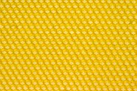
Melamine Yellow Honeycomb
 
Inspirations
Salvaged, compressed, agglomerated, woven, frayed, or the individual creations of a new recycled luxury that turns design on its head. The sensuality of the lines and the poetry of this new Arte Povera place the emphasis on materials before addressing shape and function.
Trend Accents
  • Green design materials
  • Eco-design
  • Fun chaos
  • Arts and crafts salvage
  • Artistic compression
  • Recycled vintage textures

Colours
  • Melamine yellow
  • Frosted Glass 
  • Pink light
  • Rag Paper 
  • Seaweeds

Clothing and Trim Details
Rag-weaving from salvaged textiles. Technical fasteners in compressed aluminium. Cords and ties like electric cables . Buttons in pellets of recycled glass. Buckles in sawdust chipboard. Jewels from electronic components. Patchwork tarpaulins in recycled PVC. Moiré rubber and rainbow straps. Web of recycled jeans and leather goods. Summer crochets in vintage wool and re-knits

TREND 8: RAG PAPER


Swarovski Crystal Fabric
Paper Lace

Laser Cut Buttons, Wood & Paper

Inspirations
Ammonia blue and tracing paper effect, watermarks and grid formations, waxed lacy paper and textured micro-structures take their inspiration from the new nobility of recycled and technical papers to create experimental and artistic designs.
Trend Accents
  • Art and craft paper
  • Body Art prints
  • The art of folding
  • Filigree designs 
  • Honeycombed technical kraft paper
  • Pop-up laser cutouts

Colours
Terracotta
Newsprint Grey
Pink light
Cowrie
Rapidograph Blue


Clothing Trim and Details
Tracing paper transparencies, cellophane and crystal paper. Monetic filigree and millimetre squared paper. T-shirt transfers, asymptotes and charcoal sketches. Asymmetric pleats like fans. Flounces and braid in non-woven paper. Buckles and bits in vulcanised dyed kraft paper. Dry embossed motifs for labels. Buttons, beads, origami geometric shapes. Honeycombed structures and technical ruffles. Micro-waffling, cut-outs and crepe-paper lace

Courtesy ModaMont & Farouk Chekoufi

Saturday, August 14, 2010

CHANEL RESORT COLLECTION 2011 - ST TROPEZ

Opening the collection, models basked in the sun and arrived in mahogany boats to stroll long the port, looking for a table on the terrace. The show began unexpectedly with a quirky edge to it.
With micro-minis, high-waisted dresses and light blouses, Karl Lagerfeld brought the symbols of t CHANEL to meet his idea of Saint-Tropez today. While punctuated with black and white, color  was thrown in for good measure - amber browns, absinthe and mint greens, sky and navy blues, and bright pinks appeared in block-colors as well as in the prints. Light little dresses were presented with many interesting proportions. Some showed knees and others flirted with ankles - a play on seduction appropriate for any time of day......... delicate sequinned ruffles, tweeded gossamer and fringed chiffon reigned supreme in the collection. 
A pastel palette was mixed with brights in cotton silhouettes which featured lightly flared pants and pleated blouses worn with large belts. Jeans remained an essential piece this season for Chanel; whether colored or washed, crystal-studded or fringed, they were worn as a second skin. 
Beachy dresses, frilled bikinis and little sweaters with short sleeves had touches of vichy prints. Tweed jackets and cardigans were worn with chiffon blouses, and the famous CHANEL suit saw yet again another reinterpretation. Embroidered tweed was worn with bare legs teamed with a low heels or gold leather grecian sandals. White or black broderie anglaise was teamed up with openwork leather, and the unsuspecting combination ended up being a perfect match!
Casual-chic looks in suede were decorated with embroideries with diamond-shaped stitching, while knitwear made a statement with black, white, pink and multicolored stripes decorated with trim or mixed with guipure lace. For the beach, cage dresses worn over swimsuits suggested a silhouette that was all about a reserved seduction and quiet sexiness.
Leather sandals in electric colors, bags and totes in patchwork or vichy tweed, and pearl belts brought a sparkling allure to the  balmy nights resort nights of St Tropez!

THINGS I LOVE THIS SEASON!

This season look out for these items which will add to your fashionista sensibility!

Ladies try out the season's scent - Lady Million by Paco Rabanne
Vibrant and sensual, Lady Million is fresh, floral and woody, like a nectar of voluptuous flowers, trailing delicately but still very present. Powerfully seductive, the sparkle of bitter orange with a touch of raspberry reveals the first breath. A burst of neroli follows, smooth and bright. But then the lethal weapon of heady orange blossom slips out of its sheath. Its narcotic sweetness bewitches and grabs all attention. Then, joining with Arabian jasmine underlined by gardenia, the blend soars into something more carnal, yet ever subtle. Now the obsessive pulsing of patchouli enters the fray, pacifying the honey with an addictive and terribly tempting sweetness. Amber spreads to become all enveloping, floating around the beauty, following each movement and offering its most beautiful facets, like a play of light on a diamond.

Get your hands on the De Grisogono INSTRUMENTO N°UNO

Ten years have passed since Instrumento N°Uno made its entrance onto the watchmaking stage. During this time we have seen many variations, from the most understated for him to the most dazzling for her, of a timepiece considered from its beginnings as a luxury watch. White diamonds, pink sapphires, paraiba tourmalines, tsavorites… to celebrate 10 years of the collection, Fawaz Gruosi, founder and chairman of de GRISOGONO, revisits this icon with a daring, resolutely Pop Art approach.

Look out for the new product from  La  Prairie THE CREAM CAVIAR ILLUMINATING SYSTÈME

This cream is meant to prevent future signs of aging with anti-oxidants, including White Truffles, White Wine Extract, and a White Flower Complex
Dark spots and uneven coloring can give your skin an aged look beyond its years.  This potent anti-pigmentation serum interrupts the cycle that creates age spots, stopping discoloration before it begins.

Courtesy of Paris PlanetFashion

Friday, August 13, 2010

FASHION WEEK - TO DO OR NOT TO DO?


We have had tons of requests for tickets to our show at Fashion Week............despite us not showing this season. Many of you have asked why and some avid fashionistas seem astounded to the point that they still gagging over their tepid Evian bottles of water. So to dispel any myths of us staging a coup and launching our own fashion week (the very thought of it sends a shiver down my spine amidst all the Circque du Mode theatrics going on at present) or the fact that I am completely immersed in our events business...........herewith the reason/s!


Firstly, we have just come out of a World Cup and whilst we all enjoyed the great spirit and sense of patriotism on show we all suffered that awful period of having soccer on our mind 24/7. Whilst I can't say that it applied to me personally, what I will venture to say is that it did bring many things to a stand still whether is was simple work productivity, supplier delays or simply the fact that it seemed like Christmas in July. Most of those badly dressed (and often tacky) WAGS hung on to their H&M dresses like a vuvuzela stuck to the lips of those demented South Africa fans who blew it at a drop of a makarapa! So  many of us knew that accessing the so called onslaught of potential foreign clients would be akin to rediscovering the Cullinan diamond. So we decided to work on doing more international marketing and working on our online boutique which is taking far longer then we expected. Technology is frustrating and needs to be tweaked more then a toile for Oprah Winfrey I've learnt!

Be that as it may, being asked to fill in an absurd questionaire 2 months before a fashion week takes place and then still having to wait for a 'selection' committee to agree to you showing is a bit all too much. Why put established designers through all that? Is it necessary? Or is it just a smoke screen for organisers to be appear to be diligent? It's day 2 already of fashion week and the general word out there is that it has not gone as well as anticipated and the collections are looking a bit tired leave alone the ghastly trend interpretations that some designers have conjured up. So much for the selection committee then?

Are fashion weeks losing  their appeal? I think they have and certainly they seem to have lost focus on the real reason that the industry hosts them. Where's all the business transactions or row of buyers that we should have? Enjoying the tail end of the European summer holidays I think.............
We need to seriously assess where and how we show as designers. Do we show to an audience that is there to socialise or think its hip to be seen at an event like fashion week or do we show to people who are our customers and to new audiences waiting to spend at our stores? The choice seems pretty obvious to those endowed with common sense alas not quite with the powers that be.

I am responsible for the livelihoods of my staff and the loyal people who work in every aspect of my business. Launching or showing a new collection is not a rash decision and not one that I take lightly. We plan extensively for these things and we plan exactly what we aim to sell to either existing clients or new clients that we aim to introduce to our product. Leave alone the PR and marketing activity that goes into making sure that one's work is given the right exposure. Nothing is done with our proper planning and the precise execution of a Samurai warrior!

In any event most people and certainly designers will tell you that collections have a longer life span. We are still delivering repeat orders on our Autumn/Winter 2009 Couture collection and the Spring/Summer 2011 collection we took a risk by launching in early July because we were not sure of when fashion week would be held and whether we would have received an invite to participate. It was the prelude to World Cup and strategically it was the right thing to do! So again its a reason for us not having shown a collection. Another reason is, and one we are brimming with pride over, is the launch of our men's bespoke range. This is about to launch but in doing so we have had to invest time, labour and capital into setting up a different infrastructure to manage the production of this which is separate to our womenswear studio.

Many things must change with our fashion weeks..........it needs strategic direction and a boost in creativity together with ironing out the major snags. We most definately will return to show but for now I am happy working on the growth of our business and preparing for what is still going to be a harder year of trade. A reserved and more cautious approach in the luxury goods industry is called for and the urge to explore new gaps in the market.


Moving forward the question on many people's lips are whether any of the fashion weeks are appropriate for them as platforms to show on? Perhaps working on one's own show yields greater results? We saw this last year by staging our own show off site and being able to invite people we wanted to and to execute our show the way envisaged. Maybe the catwalk is becoming obsolete? This has certainly held true for many designers abroad who have gone out to do exhibitions in different venues and without models? It's a changing world out there and one must have one's ear to  the ground and be exceptionally realistic in making decisions around launching collections or showing at a fashion week for the sake of merely showing. I choose not to show this season at fashion week..........not until things change and it's worth my while and that of my business.

VOTE FOR FASHION

 
    nominate this blog